Your Brand Kit: palette, type and decoration
Locking a palette — from a preset or from your own photo — adding a logo, choosing a font pairing, and picking how your label art is composed.
The Brand Kit is the first screen in Signature — for how the whole feature fits together, start at What Signature is. On a fresh studio the Brand Kit says what it's for: "set your studio's look once and it flows into every label you print. Pick a palette from a photo or a ready-made set, add a logo if you have one, and your business details (edited in Settings) round it out."
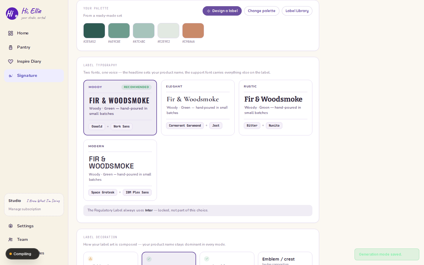
Lock a palette
Two ways in:
- A ready-made set — pick one and it locks.
- From a photo — drop in an image and Signature pulls colours out of it. Review what came back, then lock it.
Locking matters because everything downstream reads the locked palette, not a live guess. Once it's locked the card shows your colours with Change palette to reopen the picker, plus the two entry points onward: Design a label and Label Library.
Nothing else in Signature works until a palette is locked. Label Studio's whole surface sits behind that gate.
Add a logo
Optional. Upload one and it's stored with the kit; Remove takes it back out.
Label typography
Pick a font pairing rather than one font at a time — as the card puts it, "two fonts, one voice — the headline sets your product name, the support font carries everything else on the label." Four ship:
| Pairing | Faces | |
|---|---|---|
| Moody | Oswald + Work Sans | Recommended — and the default |
| Elegant | Cormorant Garamond + Jost | |
| Rustic | Bitter + Nunito | |
| Modern | Space Grotesk + IBM Plex Sans |
The preview at the bottom of the page shows a sample product name in your pairing and your decoration mode at once.
One face is not part of the choice. The Regulatory Label always uses Inter — locked. A compliance label is read for information, not for character, and it stays legible at small sizes across every studio.
Label decoration — how the art is composed
Four modes, and the picker names what each one is for. "How your label art is composed — your product name stays dominant in every mode."
| Mode | What it is | Note |
|---|---|---|
| Full-bleed art — painterly background | "AI paints the whole label — the most decorative option, and the easiest to end up busy or hard to read." | Use sparingly |
| Accent icon — solid field + motif | "A solid brand-color field with a small accent motif above your product name." | Recommended |
| Border / frame — ornamental edge | "An ornamental border frames your product name on a solid field." | Recommended |
| Emblem / crest — badge composition | "A layered crest/badge treatment frames your product name." | Premium |
New Brand Kits start on Full-bleed art, and it's the one the picker flags with a caution rather than a tick. The two recommended modes put your product name on a solid brand-colour field, which is both easier to read on a small label and cheaper to produce — see AI label art for why the mode you pick changes what the generator does at all.
Business info
Shown here, edited in Settings. Your business name, address and contact are what a compliance label carries, and keeping one editable copy means a change reaches every label at once.
If your details aren't filled in yet, the card says so rather than printing a label with blanks in it.